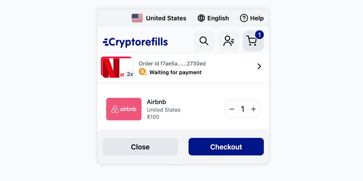
Basket 2.0


As a starting point of Cryptorefills interface redesign we sought, as you might imagine, to identify problems with the existing user experience. One experience that we identified as in need of improvement was the order completion flow for those users who don’t use wallets such as GatePay or layer-2 networks including Lightning.
The problem
The existing experience left users on the checkout page until the order was completed. If a user navigated away from the order checkout or accidentally closed the tab, there was no clear, easy mechanism to return to it.
Where we did provide the mechanism it existed only outside of the order flow (account settings and emails). This led to unnecessary effort by our users to recreate lost orders and abandoned carts. Thus we arrive at the problem ”As a user it should be clear and easy to return to an order”.
The solution
Some considerations we had when thinking of ways to resolve this pain point:
- We should avoid creating a new out of experience silo for this mechanism
- We should integrate the mechanism within existing UI features that users are familiar with. No point putting it anywhere you wouldn’t naturally find it.
After several rabbit holes and discussions, we realised it was staring us in the face. A clear, easy way to an order already existed, though limited to future orders: the basket. We could solve the problem by increasing the functionality of the basket to not only show “future” orders but also orders that are:
- completed
- pending
- expired
- awaiting payment
All in one convenient experience that users are already familiar with.
A better basket
Now there is no need to stay on the checkout page. Simply complete the order as usual and move on with your day. Want to quickly check the status of recent transactions? Accidentally close a tab? No problem, just open your basket and you’ll find it again.

Of course, it is still possible to view your order history in account settings and emails but, we think this is more convenient for the majority of users.
Hope you like it.